
Harrods Magazine App
-------------------------------------------------
Client: Harrods
UX/UI
The Challenge
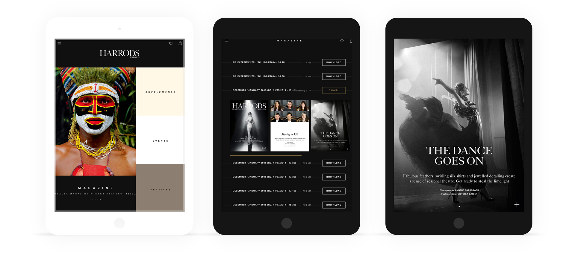
Harrods wanted to showcase their monthly print magazine in a digital edition; the aims is to deliver a premium quality magazine to all mobile devices smartphones and tablets for iOS and Android.
The new digital magazine must be able to manage via a CMS to simplify and shorten the production. The previous magazine was based in a HTML canvas.
The new digital magazine must be able to manage via a CMS to simplify and shorten the production. The previous magazine was based in a HTML canvas.
My role as a UX/UI designer was to re-design the template and resolve the UX/UI issues on the previous app, with a mobile-first mentality.
The Solution
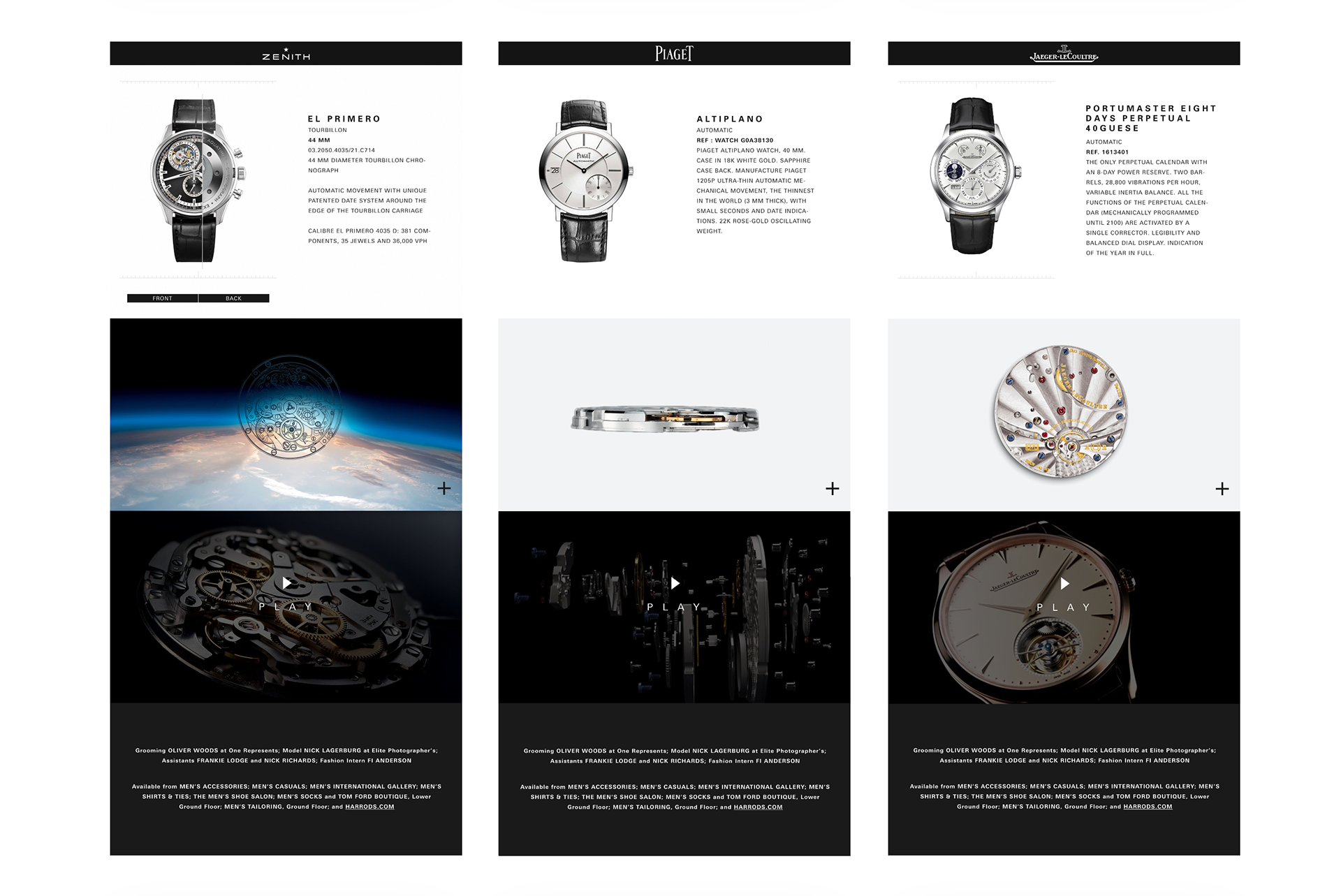
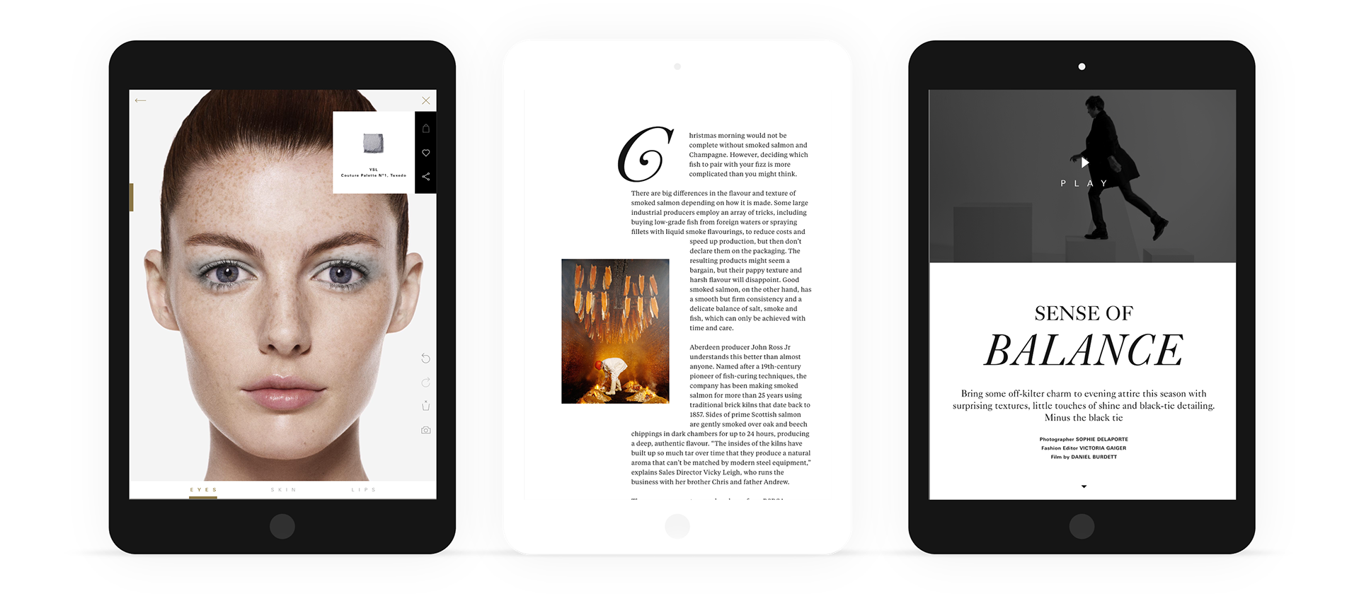
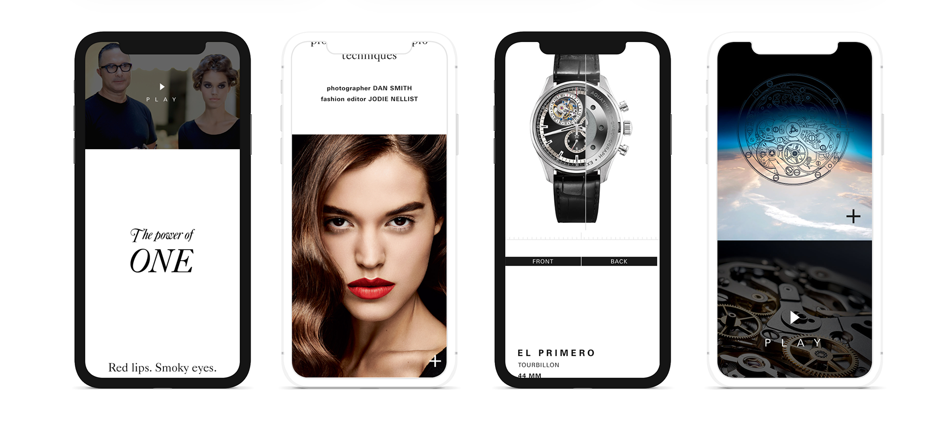
We produce a unique responsive design with a mobile-first mentality, whether on a smartphone, tablet or desktop.
The individual layout elements are designed to be as flexible and user-friendly as possible, adapting smoothly and dynamically to both text and image content for all screen resolutions.
Harrods Magazine app was the first responsive native app (for iOS and Android) that is maintained via a CMS.
The individual layout elements are designed to be as flexible and user-friendly as possible, adapting smoothly and dynamically to both text and image content for all screen resolutions.
Harrods Magazine app was the first responsive native app (for iOS and Android) that is maintained via a CMS.
The Results
With the new Harrods Magazine, we speed the process of making the monthly issue by 200%. We reach 2M downloads on the App Store and Google Play, and we won the Lovie Awards 2013 - best digital magazine of the year.


